
SaaS
Web Design
Product Design
Objective
Somewhere between the Monday standup and the Friday retro, priorities stop being decisions and start being assumptions. Everyone's busy. Nobody's sure busy doing what matters most. Priora was built for that gap. not to replace the tools teams already live in, but to sit one step above them. To look at everything in flight, make a call about what deserves attention right now, and show exactly why. The design had to make that feel less like software and more like having a sharp operator in the room.
The Challenge
The product had a clear thesis. The design problem was keeping it. One degree too far in either direction and Priora becomes something it isn't. another list to manage, or a chatbot waiting for the right question. Neither works. The teams this product is built for have seen both, and they're tired of both. Every screen had to feel like a confident answer, not an interface asking you to do the thinking yourself.


The Solution
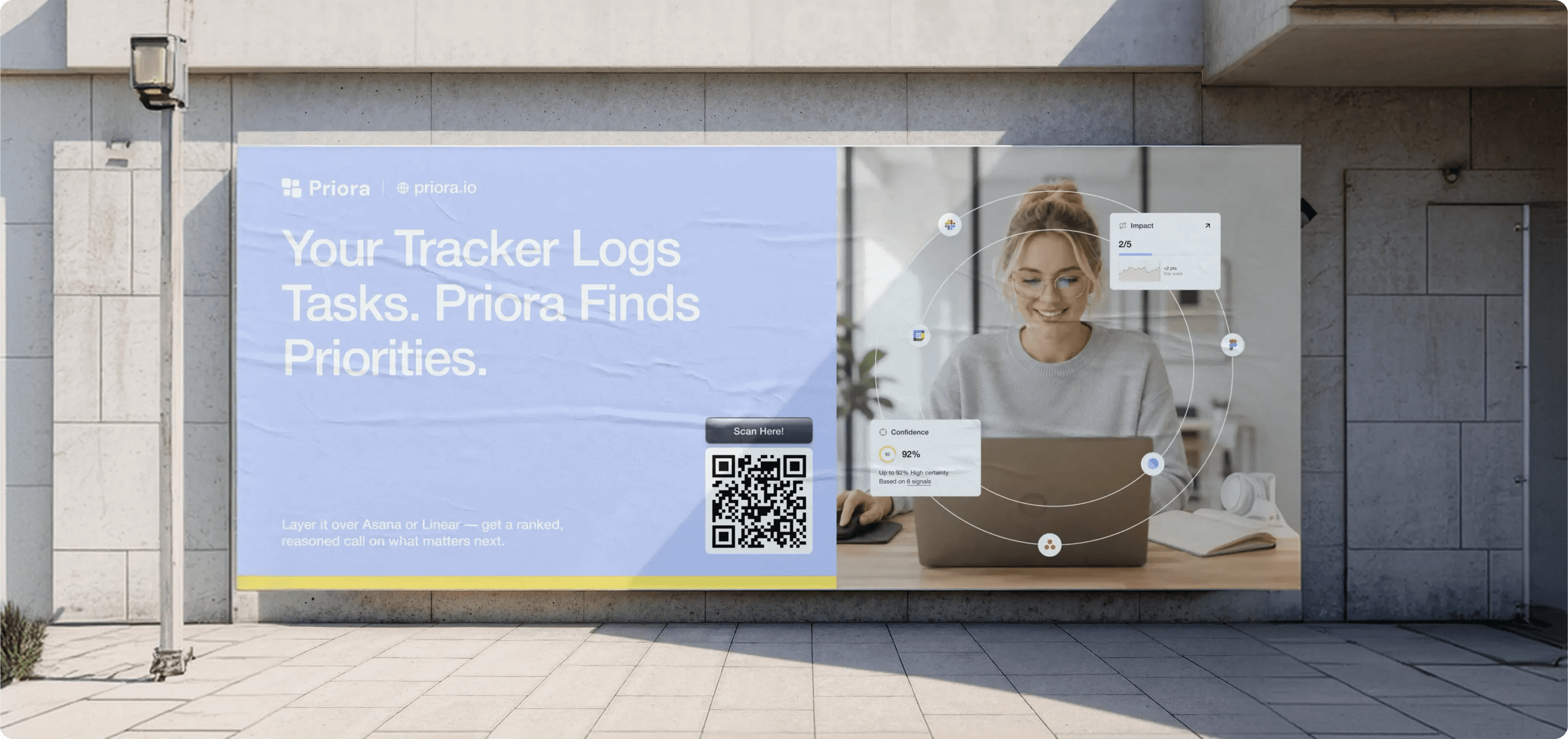
We kept two things locked together throughout: the call, and the reason for it. Not on separate pages. Not behind a toggle. Right there, in context, at the moment it's useful. The priority shifts, and so does the explanation a one-line delta that tells you what changed and why it matters today. Visually, the goal was the same: structured enough to feel trustworthy, restrained enough to stay out of the way. A product that tells you what to do next without making you wonder if it's right.



The Results
The clearest signal came from the people the product was built for. When team leads saw the priority panel for the first time. the ranked call sitting next to the reasoning, updating as context shifted, the response wasn't about the design. It was about recognition. This is exactly what we've been missing. That reaction is the one that matters: not that the product looked good, but that it immediately felt necessary.
SaaS
Web Design
Product Design
Dribbble